31 NYC Taxi Rides Data Analysis with Excel
In this assignment, we will clean, explore, and analyze a comprehensive collection of taxi ride records from New York City (see file nyc_taxi_rides.csv). Records are generated from individual taxi trips. Each trip is logged electronically through a digital metering system that captures detailed information from the moment a taxi trip starts (when a passenger is picked up) to the moment it ends (when the passenger reaches their destination). Pickup and drop-off locations correspond to taxi zones (see nyc_taxi_zones.csv) within the city’s five districts, referred to as boroughs (see below).
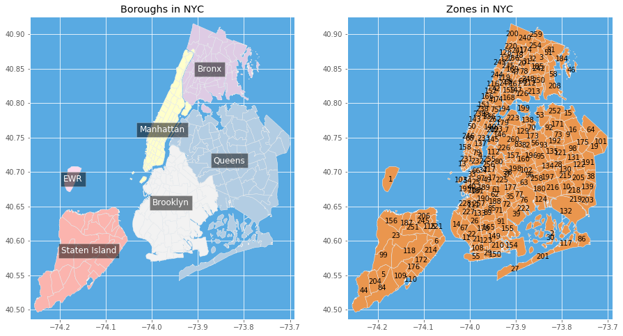
New York City boroughs (districts) and taxi zones.
31.1 🧠 Learning Goals
By completing this assignment, you will be able to:
- Efficiently filter, select, and transform data using Excel.
- Identify and correct common data issues, ensuring clean datasets.
- Augment and visualize datasets.
31.2 🔧Instructions
Upon completing the assignment, upload the following:
- The
.xlsxworkbook. - The
bar_avg_tip.svgfigure.
31.3 📝Assignments
The following assignments are divided into the following sections:
- Data Cleaning: Prepare the data for analysis.
- Data Augmentation: Add new features to the dataset.
- Data Formatting: Format the data for analysis.
- Data Querying: Answer specific questions about the data.
- Data Analysis: Perform statistical analysis on the data.
31.3.1 Importing the Data
- Import the .csv data from nyc_taxi_rides.csv into a worksheet “Raw”.
- Import the .csv data from nyc_taxi_zones.csv into a worksheet “Taxi zones”.
31.3.2 Cleaning the Data (worksheet “Processed”)
Copy the data and headers from the following columns of the worksheet “Raw” to a new worksheet “Processed”.
pickup_datetime: The date and time when the meter was engaged.dropoff_datetime: The date and time when the meter was disengaged.pickup_location_id: Taxi zone in which the taximeter was engaged.dropoff_location_id: Taxi zone where the taximeter was disengaged.passenger_count: The number of passengers in the vehicle.trip_distance: The elapsed trip distance in miles reported by the taximeter.fare_amount: The time-and-distance fare calculated by the meter.tip_amount: Tips given with credit card (cash tips are not accounted).
Turn the copied data into an Excel Table.
Delete all entries where
trip_distance≤ 0, orfare_amount≤ 0, orpassenger_count≤ 0.
31.3.3 Augmenting the Data (worksheet “Processed”)
- Convert the values from
trip_distancefrom miles to kilometers (1 km = 0.621371 mile). - Change the
trip_distancecolumn name totrip_distance_km. - Create a column
ride_length_classto categorize rides according to theirtrip_distance_km:- Short:
trip_distance_km < 1, - Medium:
1≤ trip_distance_km < 5, and - Long:
trip_distance_km ≥ 5.
- Short:
- Use the
VLOOKUPorXLOOKUPfunctions to look up in worksheet “Taxi zones” the names of the boroughs corresponding to each location in columnpickup_location_id. Add these boroughs to a new column namedpickup_borough.
31.3.4 Formatting the Data (worksheet “Processed”)
Order columns as follows:
pickup_boroughpickup_location_idpickup_datetimedropoff_location_iddropoff_datetimepassenger_counttrip_distance_kmride_length_classfare_amounttip_amount
Adjust column widths so all headings can be seen.
Freeze the first two columns (
pickup_boroughandpickup_location_id) and the top row.Sort the data hierarchically (ascending order) according to the following levels:
pickup_boroughpickup_location_idpickup_datetime
Apply conditional formatting to highlight (yellow fill) all rows where the
tip_amountis higher than 10 dollars.
31.3.5 Data Querying (New Worksheet “Queries”)
- In cell B2, write a formula that calculates the average
fare_amount. - Use a formula in cell B3 to determine the total number of rides whose
passenger_countis greater than 3 andtip_amountis greater than 10 dollars. - Use a formula in cell B4 to find the most frequent
dropoff_location_idfor rides departing from Manhattan.
31.3.6 Data Analysis (New Worksheets “Histogram” and “Pivot”)
Use the Analysis Toolpak to create a histogram of the column
trip_distance_km(use ten bins). Display the histogram in a new worksheet “Histogram” (also show Pareto and Cumulative Percentage in the chart). Change the x-axis title to “Trip Distance (Km) and the y-axis title to”Frequency of rides”.Create a Pivot table of all the data on worksheet “Processed” and place this in a new worksheet called “Pivot”. Then, display per
pickup_borough:- The total number of rides,
- The average
fare_amount, and - The average
tip_amount.
Sort the boroughs in descending order of average
tip_amount.
31.3.7 Data Visualization (New Worksheet “Charts”)
Using data from your pivot table, create a bar chart in a worksheet “Charts” showcasing the average
tip_amountfor eachpickup_borough. Add to the chart:- An x-axis entitled “Departure borough”;
- A y-axis entitled “Average tip amount (dollars)”;
- A title “Tipping behavior of NYC taxi users”.
Export the chart to a .SVG figure entitled
bar_avg_tip.svg.